Originating & Evolving A Health Brand
Verywell
Timeframe
Four months
(Jan 2016 - Apr 2016)
Role
Lead UI/UX Design from start to finish
Art Direction
Design QA & final sign-off
PROBLEM/hypothesis
The About.com brand and business was at risk due to diminishing traffic and user trust even after a major rebranding in 2014. The hypothesis was that the existing site was too broad and lacked focus. This led to the strategy of creating new brands and site experiences that specifically catered to each reader's interest, starting with health. This would more effectively engage the audience, increasing their trust and loyalty to the brand.
project kickoff workshop

Project kick-off workshop to determine design principles and goals
My role in the project
I was the lead designer tasked with helping to explore the visual design and user experience of the first new brand, Verywell. After understanding the principles and brand attributes the business wanted, I was able to move forward with the goal of launching Verywell in only four months.
I collaborated with my cross-functional team day in and day out; openly communicating my progress and sharing visual explorations regularly throughout the life of this project. This great team engagement facilitated a focused conversation with leadership and decision makers. I explored every template experience on the site and considered the user journey with a mobile-first and atomic systems thinking mindset. Once the mobile experience came close to what we wanted, I moved on to exploring the designs of medium and wider experience of templates working closely with engineers to define every breakpoint solutions.
Clear goals, open communication and great leadership led to the launch of Verywell in just four months. Verywell’s brand was created to be a differentiator in the clinical health space and was designed to put its readers first. Verywell is now one of the top 10 health websites on the internet today.
Explorations that led to the proposed solutions
I began exploring the article page on a mobile layout as this was the most visited template a user would see on the site. The process bypassed the wireframe stage with the use of this genius spreadsheet which helped to account for all components that would make up this template. I explored designs and placement and hierarchy of all elements identified in the wireframe spreadsheet. These elements were the site header, document breadcrumbs, article header, image, by-line, share tools etc. Below is how the designs quickly evolved in a matter of weeks.
Iterate, Iterate, Iterate…
Progression of mobile first article design.
Design progress of a Type 2 Diabetes category landing page mobile design
Determining color & typography
Because ninety-five percent of the information on this site is written language, we needed to find a strong, purposeful typeface that could provide the brand it’s visual identity. At the same time, we wanted to respect the reader by clearly highlighting important context and content. Typography pairing exploration resulted in the selection of FS Albert font because of its warm and friendly characteristics as well as its strong bold appearance. We paired it with Merriweather for the main body copy which is easy to read on screens.
First style guide that came together to help communicate direction to the development team as we continued the design exploration
Signature brand attributes to tell the story
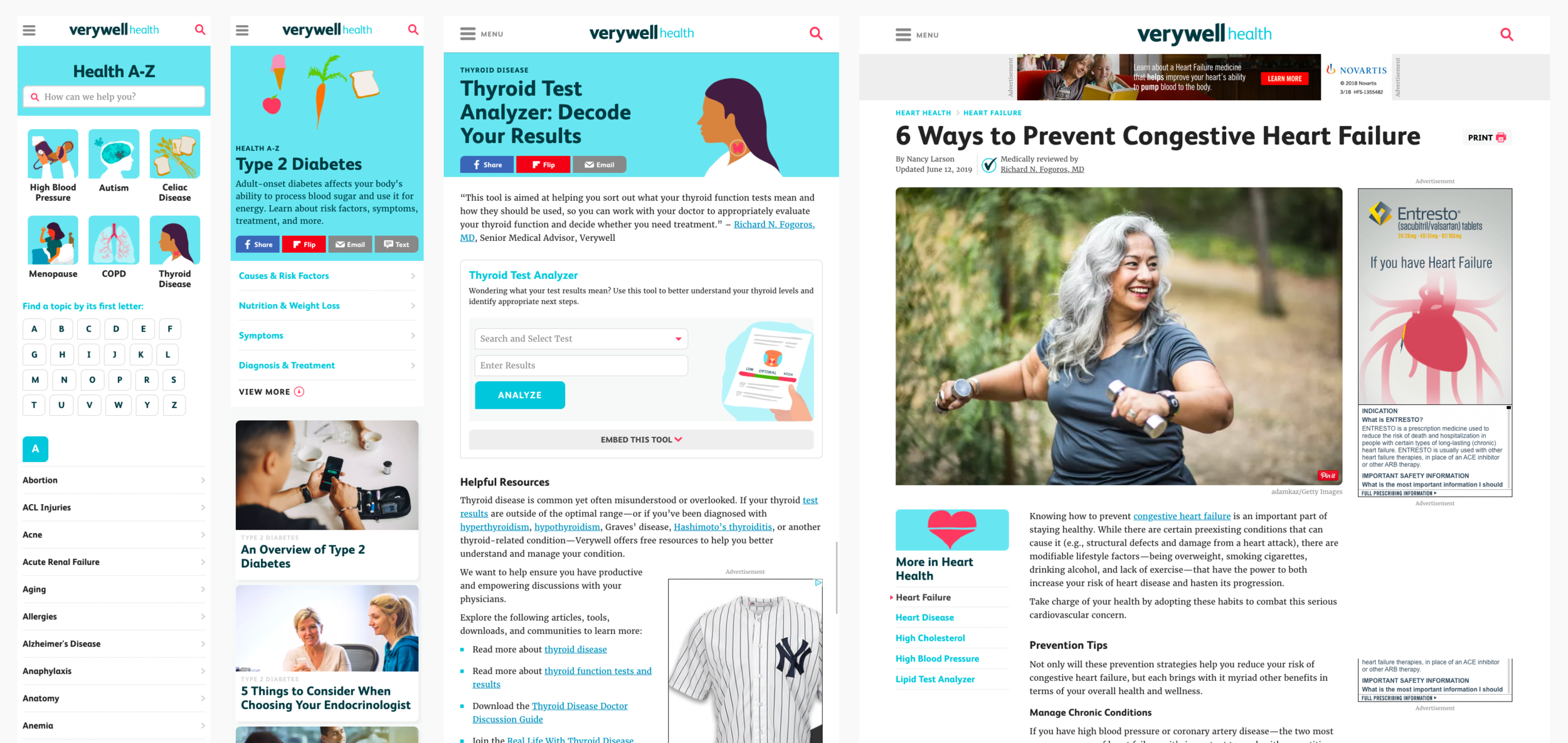
During the exploration process, the design of Verywell experience lacked a signature quality. I explored icons that could represent all the different health conditions but it proved difficult to do for every condition. So we ventured into exploring a custom illustration style that provided a human touch that displayed the right balance of playfulness and warmth . The color palette was established to give the designs a calming yet cheery and personable experience. Rounded corners around images and containers visually softens the look and helps to take the edge off reading about serious health topics.
Providing Users Context and Navigation
Initial reading experience on About Health was unclear and there was no easy way to navigate the depth of content available to users on a given topic. It was critical to design a system to help guide the users to take the next step and to provide them context for where they were in the universe of that topic. I looked at others sites for inspiration and designed a left navigation that is consistent and available for users throughout the entire site experience.